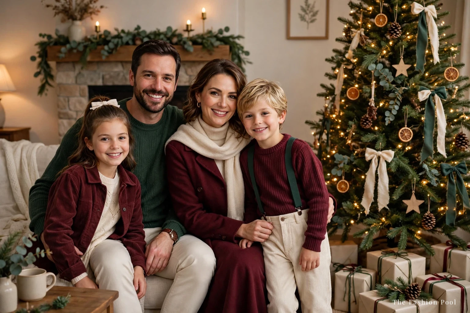
Holiday Family Photo Outfits: Coordinate, Don’t Match
The problem with holiday family photo outfits is not the outfit — it is the group. One person can be perfectly dressed and the photograph can still fail, because four people in four different ideas of “festive” do not make a photograph. They make a crowd.
The fix is coordination, not matching. Matching is everyone in the same sweater, the same color, the same everything — and matching photographs look like a uniform. Coordination is everyone in the same palette, each in their own outfit — and coordination photographs look like a family. This guide works from one rule: three colors, one neutral, one hero piece.
The palette rule: three colors, one neutral, one hero piece
The palette rule is the whole guide in one sentence: choose three colors and one neutral, and give one person the hero piece. The three colors are the palette — burgundy, forest green, and rust, or navy, camel, and cranberry, or charcoal, emerald, and cranberry — with one neutral underneath them: cream with the first, ivory with the second, soft white with the third. The neutral is the ground — the color that appears in every outfit and holds the palette together, usually cream, camel, or charcoal. The hero piece is the one outfit that carries the most color or the most texture — a velvet dress, a burgundy blazer, a faux fur coat — and it belongs to one person, not two.
The rule works because the camera reads color before it reads anything else. A photograph with three colors and a neutral reads as deliberate; a photograph with five colors reads as accidental. Count the colors in the outfits before the session, not after: lay every outfit on the bed, count the colors, and if the count is more than four, something has to go.
The neutral is the most important choice, and it is the one people skip. A neutral that appears in every outfit — the same cream in the mother’s sweater, the father’s shirt, the child’s tights — is what makes four different outfits look like one photograph. Without a shared neutral, the palette is four outfits that happen to be in the same room.
The hero piece is the second most important choice. One person wears the velvet dress, or the burgundy blazer, or the faux fur coat — and everyone else wears the quieter versions of the palette. Two hero pieces compete, and the photograph does not know where to look. One hero piece, and the eye knows exactly where to land.
Start with the mother’s outfit: choose her outfit first, build the palette around it, and let everyone else’s outfit answer it. The mother’s outfit is the photograph’s anchor, and the anchor decides the palette.
The third color is the one that appears in exactly two outfits, not all four. A color from the three that appears in every outfit stops being a color and starts being a uniform; a color that appears in only one outfit is an accident. The third color should appear in the mother’s dress and the child’s tights, or the father’s shirt and the daughter’s bow — twice, in two different places, so the eye connects them. That connection is what makes the palette read as deliberate.
Setting first: the studio
The studio is the most forgiving setting, and the easiest palette: a plain backdrop, controlled light, and no weather to dress for. The palette can be the full three colors and the neutral, because nothing competes with the outfits — the backdrop is gray or cream, the light is even, and the camera sees exactly what you planned.
The backdrop is the neutral, not a fifth color. A backdrop in the palette’s neutral is the safest choice, because it takes the palette’s colors without adding one of its own. A colored backdrop is the mistake: a red backdrop adds a fifth color, a green backdrop fights the tree, and the photograph becomes about the backdrop instead of the family. The backdrop should disappear; the family should not.
The hero piece works best here, because the studio shows texture: velvet reads as velvet, satin reads as satin, and a velvet blazer over a dark dress is the hero piece that photographs best in a studio. Our velvet blazer guide covers the shape that works over a dress, and the same shape — structured shoulder, clean lapel, no bulk — is what to look for in the mother’s version.
The children’s outfits should be the simplest versions of the palette: a cream sweater, dark trousers, a burgundy dress — no prints, no logos, no sequins. The camera magnifies everything a child wears, and a simple outfit photographs better than a clever one.
The mistake in a studio is over-dressing: too much texture, too many layers, too many accessories. The studio is a clean room, and a clean room wants clean outfits. One hero piece, three colors, one neutral — and nothing else.
Setting: outdoors in winter light
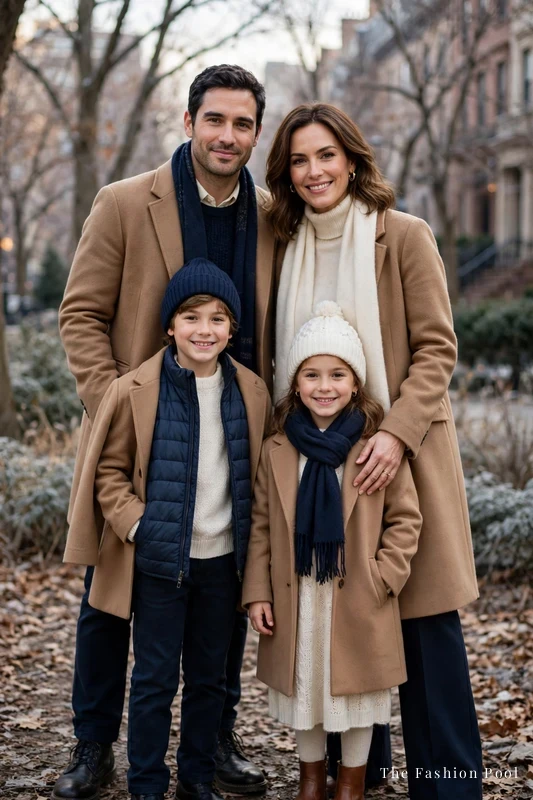
Outdoors is the hardest setting, and the most beautiful: winter light is soft, the background is real, and the photograph looks like a memory rather than a portrait. The palette has to work harder outdoors, because the background has colors of its own — bare trees, gray sky, snow, brick — and the outfits have to hold their own against them.
The coat is the outfit outdoors. A faux fur coat is the hero piece for an outdoor session — the warm layer that makes the whole family look like one photograph before anyone has posed. A camel coat is the neutral for everyone else: the same camel across two or three coats is the shared neutral that holds the photograph together in the cold.
The rule for outdoor coats: they should be the same length, or close to it. Three coats of three different lengths — one to the knee, one to the waist, one to the ankle — make the group look uneven, and the photograph reads as three people who did not plan together. Coats of the same length, in the palette’s colors, make the group look like a group.
The children’s coats are the practical part: warm, dark, and plain. A child who is cold will not smile, and a photograph of a cold child is a photograph of a cold child — no palette fixes it. Dress the children warm first, and coordinate second: a warm coat in the palette’s neutral is better than a cold coat in the palette’s hero color.
The light is the other decision: schedule the session for the hour before sunset, when the light is warm and low. Midday light is harsh, and harsh light is the one thing no outfit can fix.
Setting: at home by the tree
At home is the most personal setting, and the most forgiving: the tree is the background, the light is warm, and the photograph looks like the family’s own evening rather than a session. The palette can be softer here — cream, cranberry, soft white — because the tree brings the green and the lights bring the gold, and the outfits do not have to carry the color alone.
The hero piece at home is the mother’s dress or the father’s blazer — one piece, in the palette’s strongest color, worn where the tree’s lights catch it. The children’s outfits should be the softest versions of the palette: a cream knit, a burgundy dress, dark trousers — comfortable enough to sit on the floor, because the best at-home photographs are the ones where the children are sitting, not standing.
The mistake at home is dressing for the camera instead of the room: a formal outfit in a living room looks like a costume, and the photograph reads as staged. Dress for the room — the same outfits you would wear to a family dinner, in the palette’s colors — and the photograph reads as a family evening, which is what it is.
The tree is the background, not the competition: keep the outfits simpler than the tree, because the tree is already the most decorated thing in the room. One hero piece, three colors, one neutral — and the tree does the rest.
What the camera magnifies
The camera magnifies four things, and all four are avoidable: prints, logos, sequins, and black. A print — a stripe, a plaid, a floral — looks twice as busy in a photograph as it does in a mirror, because the camera flattens it and the pattern fights the face. A logo is worse: the camera reads the logo before it reads the person, and the photograph becomes an advertisement. Sequin is the third: one sequin top is a hero piece, and two sequins are a disco — the camera catches every sparkle and the photograph glitters. Black is the fourth: a black outfit photographs as a shape with no detail, and a family in black looks like a silhouette.
The fix for all four is the same: plain, matte, and quiet. A plain sweater photographs better than a patterned one; a matte fabric photographs better than a shiny one; a dark color photographs better than black. The camera rewards the quiet outfit and punishes the loud one — and the loudest outfit in the group is the one the photograph remembers.
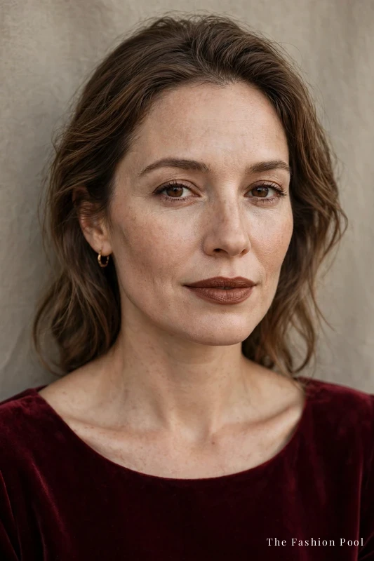
Makeup is the quiet detail that matters: a brown lipstick in the right shade for the wearer’s skin tone photographs better than a red lip, because the camera deepens red and the lip becomes the photograph. Our brown lipstick guide covers the undertone-first method, and the same method — warm or cool, read the undertone first — is what to use before a photo session.
The test for whether an outfit photographs well: take a phone photograph in the room where the session will happen, and look at the photograph, not the mirror. The mirror shows the outfit; the photograph shows what the camera will show. If the photograph looks busy, the outfit is busy — and the outfit, not the camera, is the problem.
The camera cools warm skin, and the neutral should be warm, not blue-white. A cream neutral flatters every skin tone in the group; a stark white neutral makes the skin look gray and the photograph look cold. The same rule holds for the palette’s colors: warm burgundy photographs better than cool burgundy, warm forest green better than cool forest green. The camera is not neutral — it has a temperature, and the palette should be warmer than it.
Kids and comfort: the photo depends on the toddler
The photograph depends on the toddler, and the toddler depends on comfort. A child in an itchy sweater, a tight collar, or a shoe that pinches will not smile — and no palette, no hero piece, and no photographer can fix a child who is uncomfortable. Dress the children for comfort first, and coordinate second.
The rules for children’s outfits: soft fabrics, no tags, no tight waistbands, shoes they have worn before. A new shoe is the most common mistake — the child spends the session thinking about the shoe, and the photograph shows it. Wear the shoes for a day before the session, and the session is about the photograph, not the feet.
The toddler’s outfit should be the simplest in the group: one color from the palette, one neutral, no hero piece. The toddler is the photograph’s center already — the camera finds the smallest person first, and the smallest person’s outfit should be the quietest, because the child draws the eye whether you plan it or not.
A small bribe is part of the session, not a parenting failure: a snack, a favorite toy held just out of frame, a promise of hot chocolate after. The session should take twenty minutes, not two hours — and the outfits should be comfortable enough for twenty minutes of sitting, standing, and running between poses.
The best family photographs are the ones where the children look like themselves. Dress them like themselves, in the palette’s colors, and the photograph will look like your family — which is the whole point.
The pose is the last decision, and it is simpler than it looks: the tallest in the middle, the toddler in front, the hero piece in the center. The person with the hero piece stands in the middle, the partner on one side, the children in front — and the photograph has a shape. A line of four people of the same height looks like a police lineup; a group with height in the middle and the toddler in front looks like a family. The pose should take thirty seconds to arrange, not thirty minutes — and if it takes longer, the outfits are doing too much work.
Frequently asked questions
What should a family wear for holiday photos?
Coordinate, don’t match: three colors, one neutral, one hero piece. Everyone wears the same palette in their own outfit — not the same sweater, not the same color, the same palette. Start with the mother’s outfit and build the palette around it.
What colors are best for holiday family photos?
Burgundy, forest green, and rust, with cream as the neutral; navy, camel, and cranberry, with ivory as the neutral; or charcoal, emerald, and cranberry, with soft white as the neutral. The palette needs three colors and one neutral that appears in every outfit — the neutral is what holds the photograph together. Avoid black, which photographs as a silhouette, and avoid more than four colors total.
Should a family match outfits for Christmas photos?
No — matching looks like a uniform. Coordination looks like a family: the same palette, different outfits, one hero piece. Matching photographs age badly; coordinated photographs look like the family on its best day.
What should kids wear for holiday family photos?
The simplest versions of the palette: a cream sweater, dark trousers, a burgundy dress — no prints, no logos, no sequins. Dress for comfort first: soft fabrics, no tight waistbands, shoes they have worn before. The toddler’s outfit should be the quietest in the group, because the camera finds the smallest person first.
What is the best time of day for outdoor holiday family photos?
The hour before sunset, when the light is warm and low. Midday light is harsh, and harsh light is the one thing no outfit can fix. Outdoors, the coat is the outfit — coats of the same length, in the palette’s colors, make the group look like a group.
How do you coordinate family photo outfits without buying new clothes?
Lay every outfit on the bed and count the colors: three colors and one neutral is the palette. The neutral is usually already in the wardrobe — cream, camel, or charcoal — and the hero piece is the one outfit that already carries the most color or texture. If the count is more than four colors, something has to go.
Coordinate, don’t match — that is what holiday family photo outfits are. Three colors, one neutral, one hero piece — and the photograph looks like your family on its best day.